gwaylar
New Artist
 Always fear the cute ones...
Posts: 34
|
Post by gwaylar on Aug 1, 2007 17:46:21 GMT
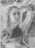
 forgive the lightness of this scan but i wanted to show the difference of this and the end result of me darkening it in paintshop. also, the face looks a little weird to me, then again, i have been staring at it for several hours now. anyway, yeah, there it is. about 2 hours in. |
|
gwaylar
New Artist
Always fear the cute ones...
Posts: 34
|
Post by gwaylar on Aug 2, 2007 4:54:27 GMT
 ok, another couple (maybe 3) hours later and a bit more done dont ask what the red specks are, something got on my scanner |
|
shiva
Art degree
Posts: 203
|
Post by shiva on Aug 2, 2007 15:28:21 GMT
Nice one on that forelast. You are clearly a manga specialist and you did a very nice job on the background  |
|
|
|
Post by zandra on Aug 2, 2007 16:44:45 GMT
Your drawing is incredible. The detail is very good! Cant wait to see it finished!
|
|
gwaylar
New Artist
Always fear the cute ones...
Posts: 34
|
Post by gwaylar on Aug 3, 2007 7:17:19 GMT
 sorry there is nothing good to show my progress between 2 and 3, but i got on a roll when i got home this evening and my pencil couldn't stop, so here you go, semi finished product. all that remains is the fun altering in paintshop to counter what all the scanner kills in detail and darkness. |
|
|
|
Post by zandra on Aug 3, 2007 20:19:44 GMT
oh! your really quick with getting on with this one! i really like your style is very modern and i can just imagine moving like in a cartoon! Just wondering Do you use a refrence?
|
|
gwaylar
New Artist
Always fear the cute ones...
Posts: 34
|
Post by gwaylar on Aug 3, 2007 21:05:46 GMT
i hardly ever use a reference for any of my stuff, for this one though i had a picture of the costume, most of my stuff just comes to me
|
|
gwaylar
New Artist
Always fear the cute ones...
Posts: 34
|
Post by gwaylar on Aug 4, 2007 5:02:43 GMT
 thar she blows, finished and fixed up with paintshop, i have about 12 more ideas on the board, i just have no clue which to do first,.....sadly i have about a week and a few days until GenCon and i dont know which to start on......so i guess you guys can choose..... Here are your choices. 1. Zaar - mercenary, weretiger, has a pet dragon named fenix(odd since he breaths ice) 2. Gwaylar - wild elf demigod, dark and mysterious type 3. Anoriah - mercenery, psion, Zaar's wife 4. Geston - sorceror, uses spiders, part dragon, has a spawn like cloak that has a massive spider web on it 5. female version of Hitman (video game) 6. Tifa Lockhart but not the typically one, i plan on modding clouds outfit for her and her with a buster sword or something (i never even played FF7) 7. Princess of Persia (cause there should be one) 8. female version of Vincent Valentine 9. fielder's choice - that is to say, you go to my deviantart page and pick a char on there i havent done recently (this year) and i'll redraw it so, yeah, help me out here... |
|
lauren
Artists Apprentice
Posts: 88
|
Post by lauren on Aug 4, 2007 10:23:13 GMT
I like your pirate, she looks great. I particularly like the detail on the rope her foot is resting on, how each twist of rope stands out, very nice. I think you should draw Zaar, sounds like an interesting character |
|
|
|
Post by zandra on Aug 4, 2007 15:17:07 GMT
I think you should draw Geston!
|
|
|
|
Post by Lianne Issa on Aug 6, 2007 12:18:53 GMT
wow! awesome drawing! love your style! very imaginative too! i'll look forward to seeing you progress
|
|
|
|
Post by boyusflare on Aug 7, 2007 5:19:29 GMT
i think you should do of Geston too  the latest is very well done, as Lianne said, love your style |
|
gwaylar
New Artist
Always fear the cute ones...
Posts: 34
|
Post by gwaylar on Aug 14, 2007 6:10:26 GMT
 Ok guys and gals, this is Zaar, and this is what i get for going against the majority vote but heres the problem,......i just doctored the living crap out of this one and it still looks like.....well, no english word for it so i'm gonna use shizno (red vs blue reference). Zaar here looks fine to me, but the background is absolute garden fertilizer. Unless one of you people vastly disagree, i'm going to scrap(erase) it and leave Zaar alone, then draw back another background, so what i need is feedback on whether i should leave it be, or give me another idea on a background to replace it. This is no where near what i wanted it to look like..... |
|
lauren
Artists Apprentice
Posts: 88
|
Post by lauren on Aug 14, 2007 12:58:12 GMT
Awww I think you're a bit hard on yourself. A lot of the time our drawings don't turn out as we imagined they would. Having said that, there's no reason why you can't re-work the background if you feel that way inclined. I'd suggest either adding different shades of grey, getting darker and blurier the further away you go to the current background, or re-work it as you see fit Or, maybe start on something else and come back to this one... give your imagination a break from this one if it is frustrating you too much. Keep your chin up, you're doing just fine! |
|
|
|
Post by sultzaberger on Aug 14, 2007 20:12:40 GMT
I don’t see anything wrong with the background as it is but if you want to try a minor change instead of scraping the whole thing may I suggest adding some more leaves on the trees and try adding a sunbeam or two shining through the branches.
Hope it helps
WILL
|
|